

Alphington Sports Medicine
Logo, rebranding and signage
A recent logo redesign for Alphington Sports Medicine, a sports medicine practice and another project about names.
The logo needed to represent the company’s recent changes, as they had consolidated their two businesses into newly renovated facilities designed by architects Prior-Barraclough.
The most significant change was the name. The company has evolved and expanded over the years, and so has its name: Alphington Sports Medicine Physiotherapy Exercise and Rehabilitation. It was a mouthful, even in acronym form: AMSPE&R or AMSPE+R. My suggestion was to loose the descriptive elements and call the company Alphington or perhaps the more expressive Alphington Sport. In the end, we settled on the name Alphington Sports Medicine with typography that emphasised the ‘Alphington’ and a logo that drew upon the ‘A’ motif.
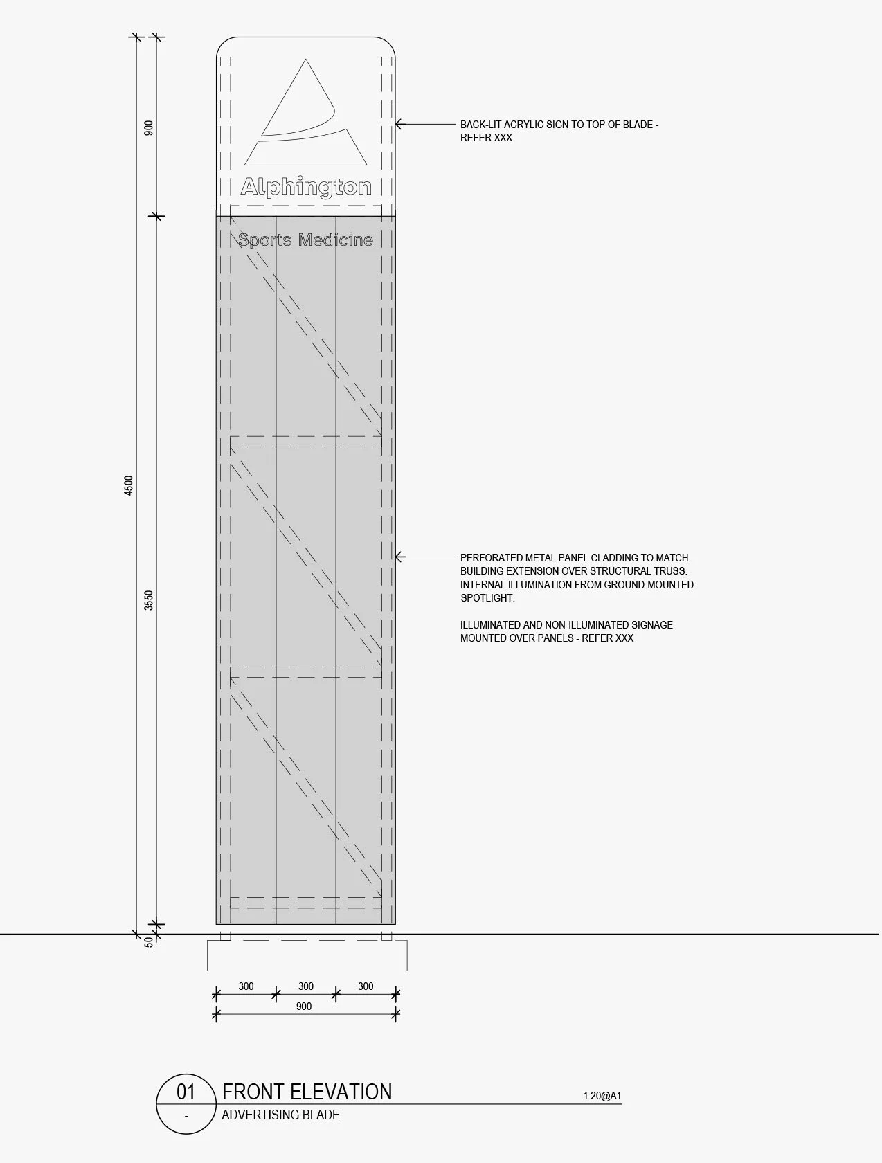
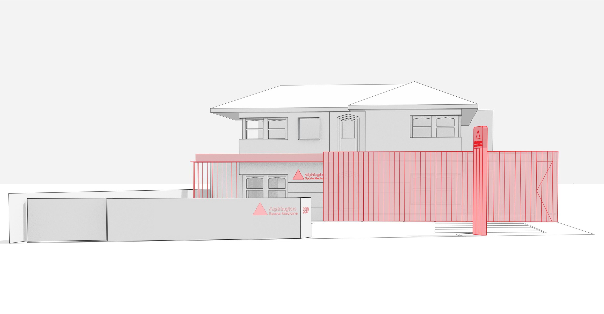
Signage produced in collaboration with the architects Prior Barraclough